MAGIK
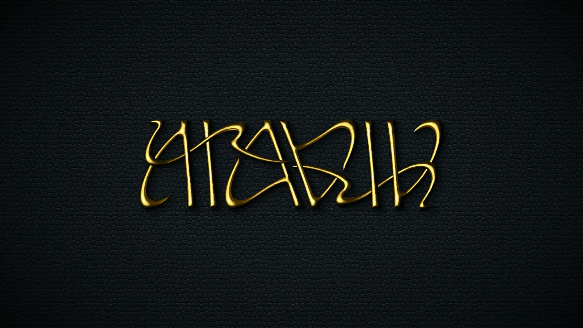
MAGIK is a small community organization founded on education around equal power exchange through enthusiastic consent. The organization had a name but sought out creative direction for the rest of their brand. They knew they wanted a logo that gave a visual representation to their mission.
Dusty Drake made it their goal to give MAGIK something that felt fluid, like the ever-changing community they represent. Through the centuries, Art Nouveau typefaces have had some of the most organic designs, but even a beautiful type face could be aesthetically elevated. So, to bring the fluidity of the organization into harmony, into equality, into symmetry, an ambigram was made. A beautiful and unique way to bring a visual representation of that equal exchange to the logo design.
Skills: Illustration | Branding | Calligraphy
Working with Dusty is a pure delight. Not only did they take into account our group’s vision for our logo, but they transformed it into a literal piece of art! I look forward to continuing to work with Dusty on all my future projects.
- Shadow
Co-Founder of MAGIK


