Queer Center
Dusty Drake was motivated to help establish an LGBT center in their state because Phoenix was the largest metropolitan area in the country without an LGBT community resource center. Dusty recognized the need for a safe and welcoming space where members of the queer community could gather, find support and resources, and connect with others.
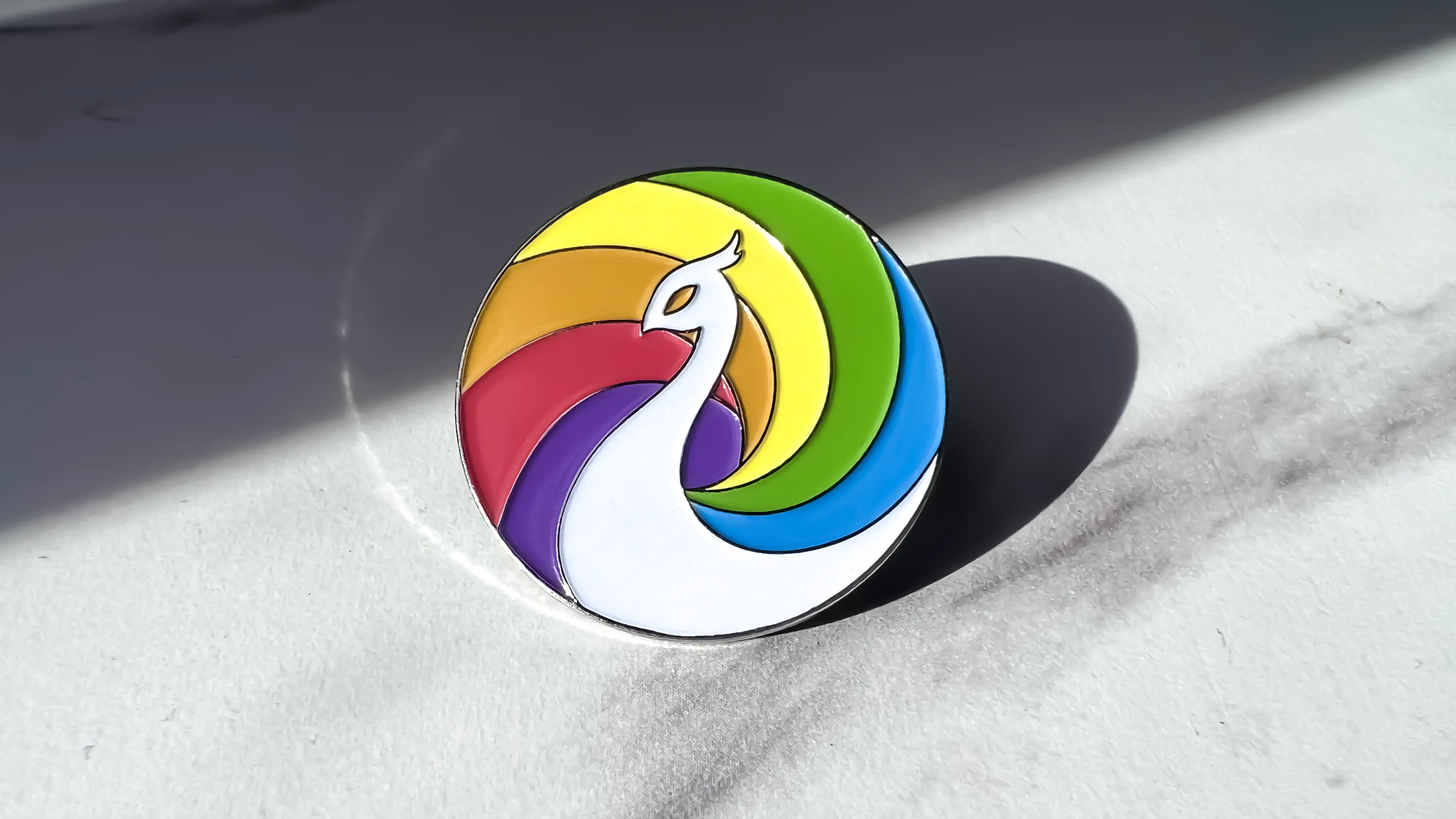
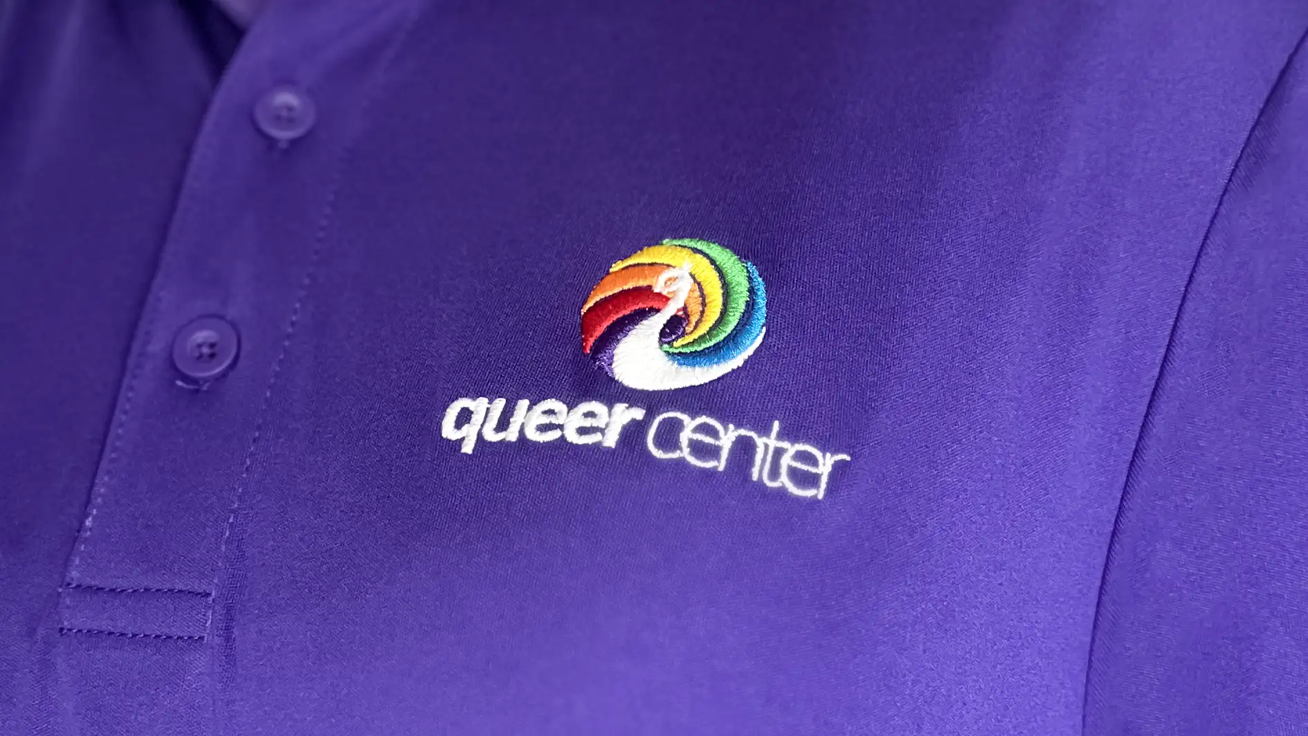
The peacock was chosen as the centers symbol because of its bright and flamboyant appearance, which reflected the pride, diversity, and vibrancy of the queer community. The peacock is also often seen as a physical manifestation of the mythical phoenix, adding even deeper meaning to it. These associations made the peacock an ideal choice for the center.
The team wanted to create a space that was welcoming to all members of the queer community, regardless of their background or identity. The inclusion of the word queer was important to the team since the word queer had been reclaimed by the community and is often viewed as more inclusive than the ever-growing 2SLGBTQIA+ acronym. The name Queer Center was chosen to reflect the center's commitment to fostering and maintaining inclusivity for the evolving community without limiting their audience to identities directly reflected in the acronym.
Skills: Branding | Illustration | Web Design
Dusty Drake is a phenomenal designer. They create some of the most amazing artwork and are so easy to work with. They listen to what the client’s vision is and create it. They possess the skills to create and deliver an outstanding product. The Queer Center logo was created by Dusty and has now become a symbol of Pride. We would request their talents again and again without reservation when the opportunity arises.
- Jesse Baltazar
President & CEO of the Queer Center