reNature
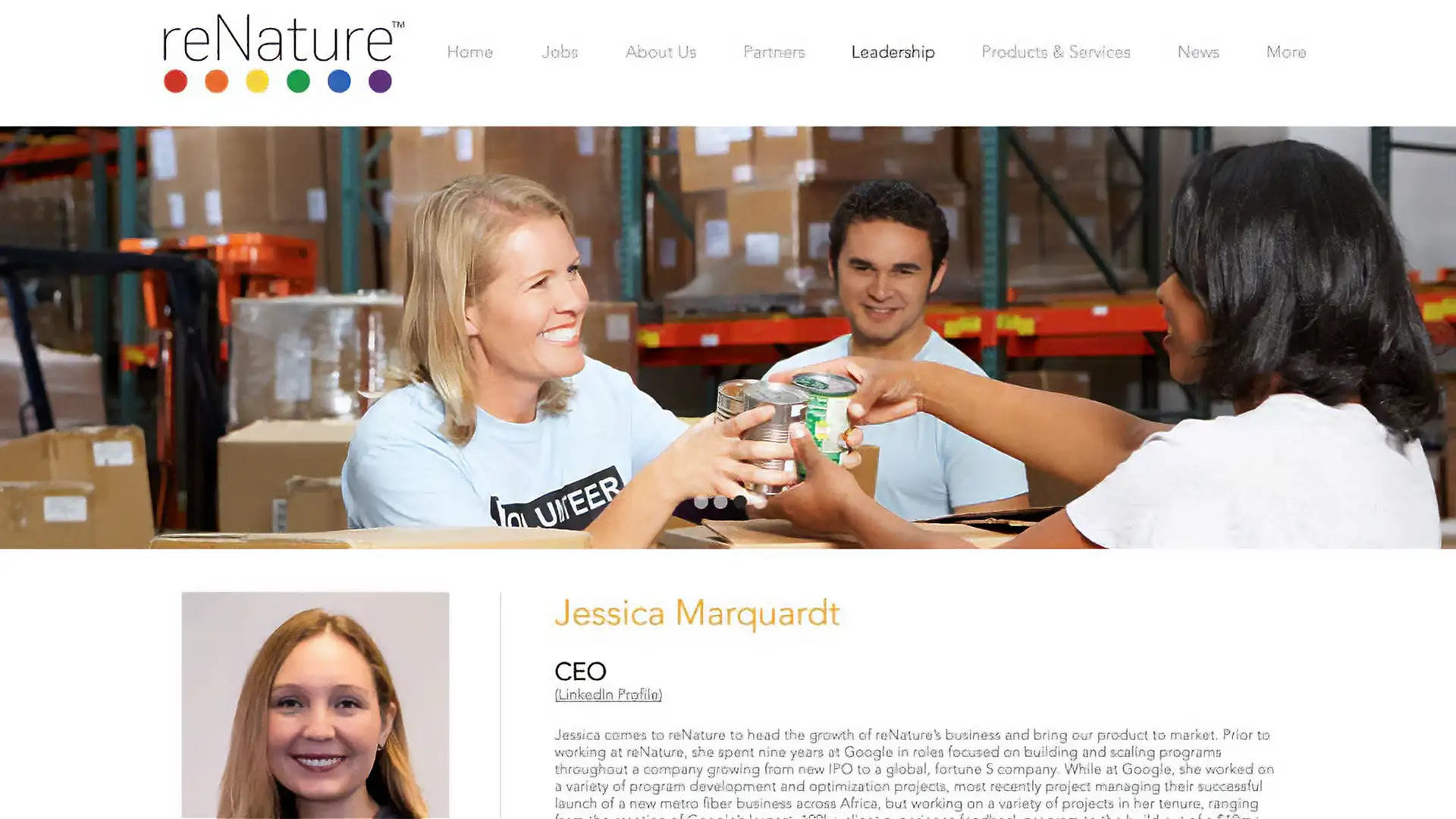
reNature came to Dusty early in the foundations of their business venture. The startup created a digester, designed to take large amounts of food waste, and turn it into a nutrient-rich soil additive. This additive helped plants thrive while simultaneously diverting food waste from landfills.
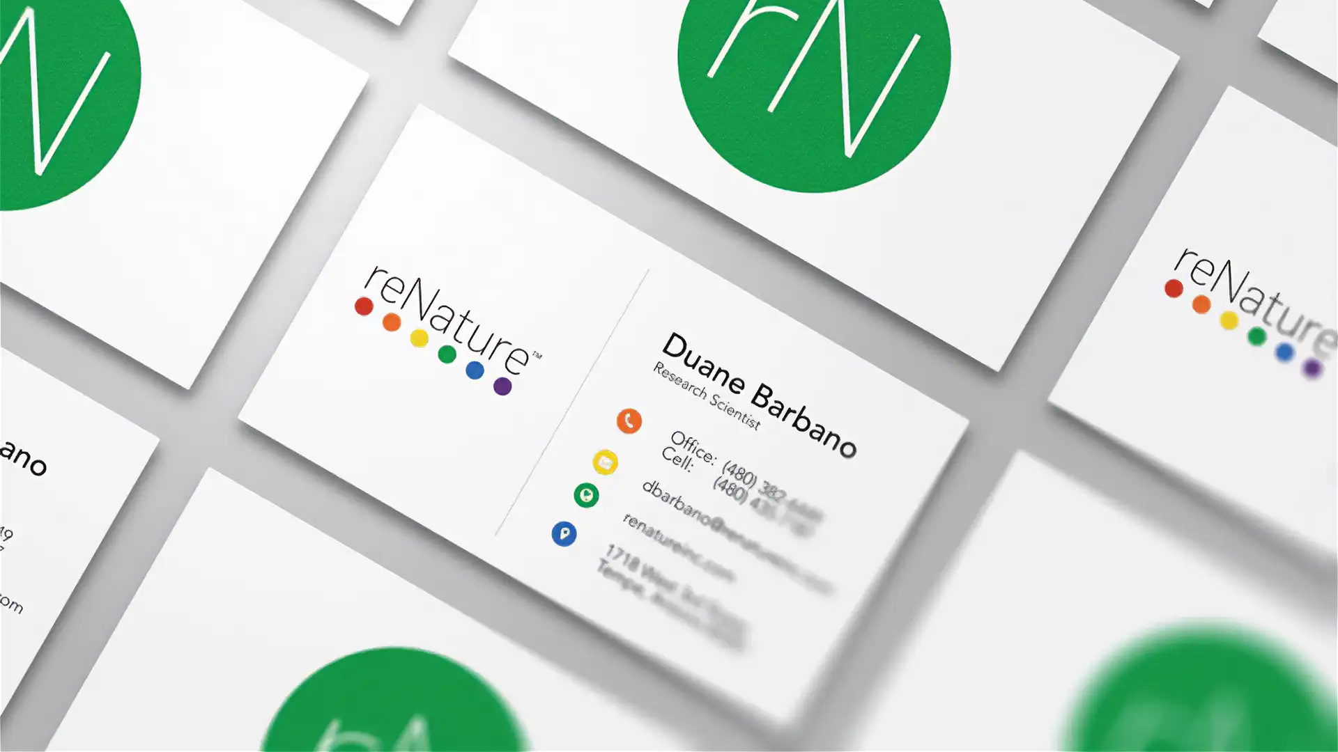
Dusty's design approach for reNature's logo was rooted in the core elements of the company's product, nitrogen, phosphorus, potassium, humic and fulvic acid, and lastly, its overall ability to restore soil. A dot was included to represent each of the product’s primary compounds and were used to ground (pun intended) the logos typeface. Dusty chose a light and friendly typeface, to represent the company's commitment to sustainability and to appeal to new customers when they entered the market amongst some very large competition. The overall design was clean and modern, reflecting the cutting-edge technology used in the creation of the nutrient-rich soil additive.
Skills: Branding | Web Design | Photography
Dusty’s help was critical in developing a consistent and powerful branding strategy that perfectly encapsulated reNature’s product roadmap. Together, we were able to combine our corporate strategy with Dusty’s eye for the customer and product differentiation in a few rapid collaboration sessions. Dusty delivered incredible branding standards that integrated our logo perfectly into printed, web, and packaging materials and templates. Their ability to quickly iterate kept costs under control while making our team feel engaged in the design process. I don’t know how we could’ve launched our first products so quickly without their experienced eye for both design and packaging.
- Evan Taylor
CEO of reNature, Inc.